My Fault Title Sequence
Title Sequence
2025
About
This project is a kinetic type title sequence inspired by the bestselling book My Fault by Mercedes Ron. I wanted to explore how typography alone could carry emotional weight, set the tone, and hint at the story’s core themes—conflict, magnetism, and vulnerability—without relying on characters or literal visuals.
Concept
The concept was centered around translating emotional tension into type movement. I focused on the idea of a magnetic push-and-pull relationship, mirroring the dynamic between the protagonists. Through fragmented transitions, bold entrances, and subtle dissolves, I aimed to let the text “perform” the drama embedded in the narrative.
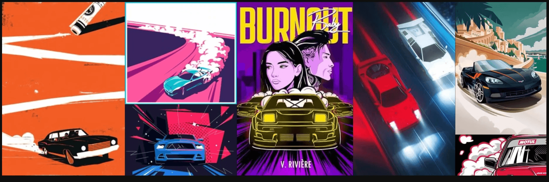
Brainstorming
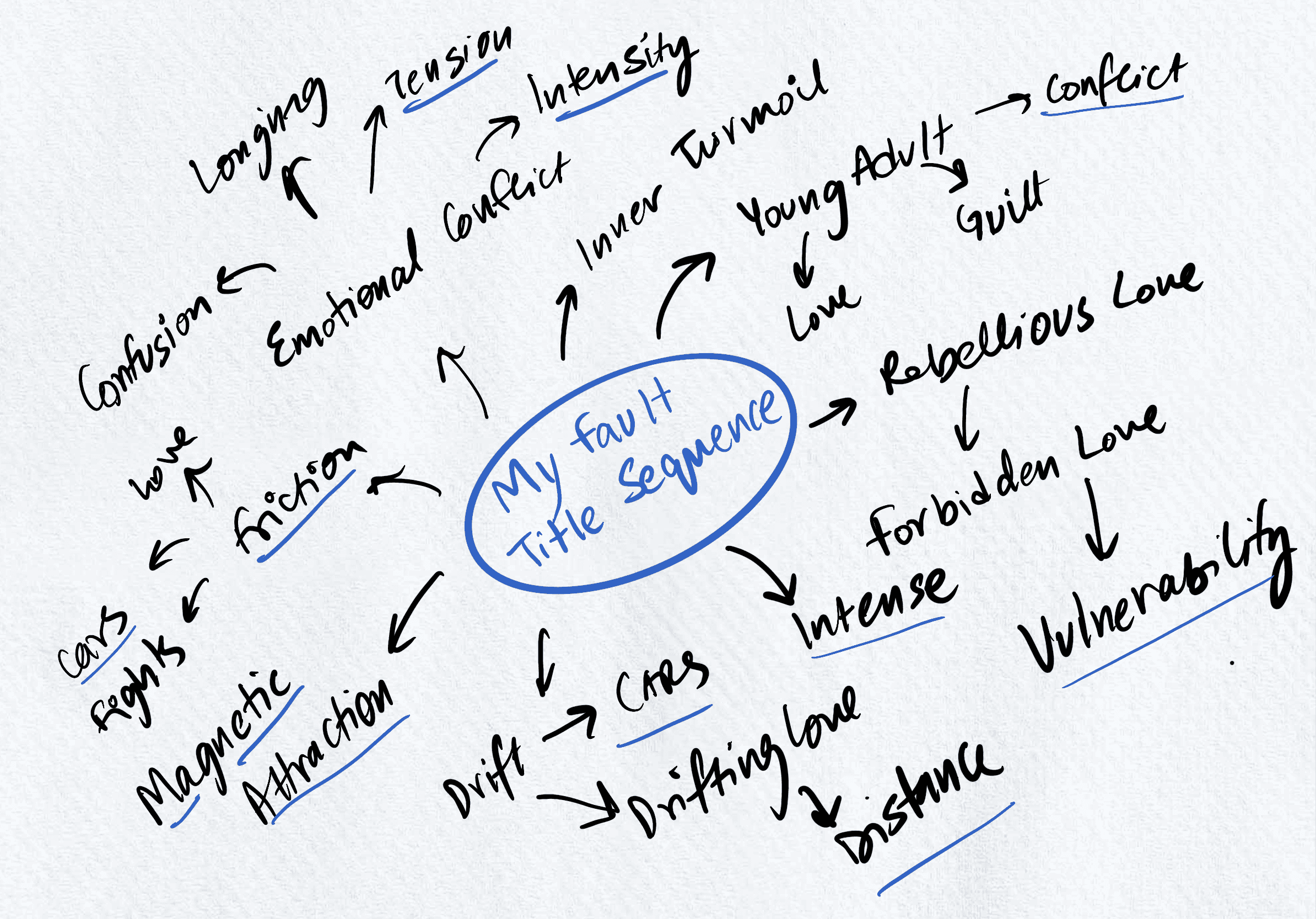
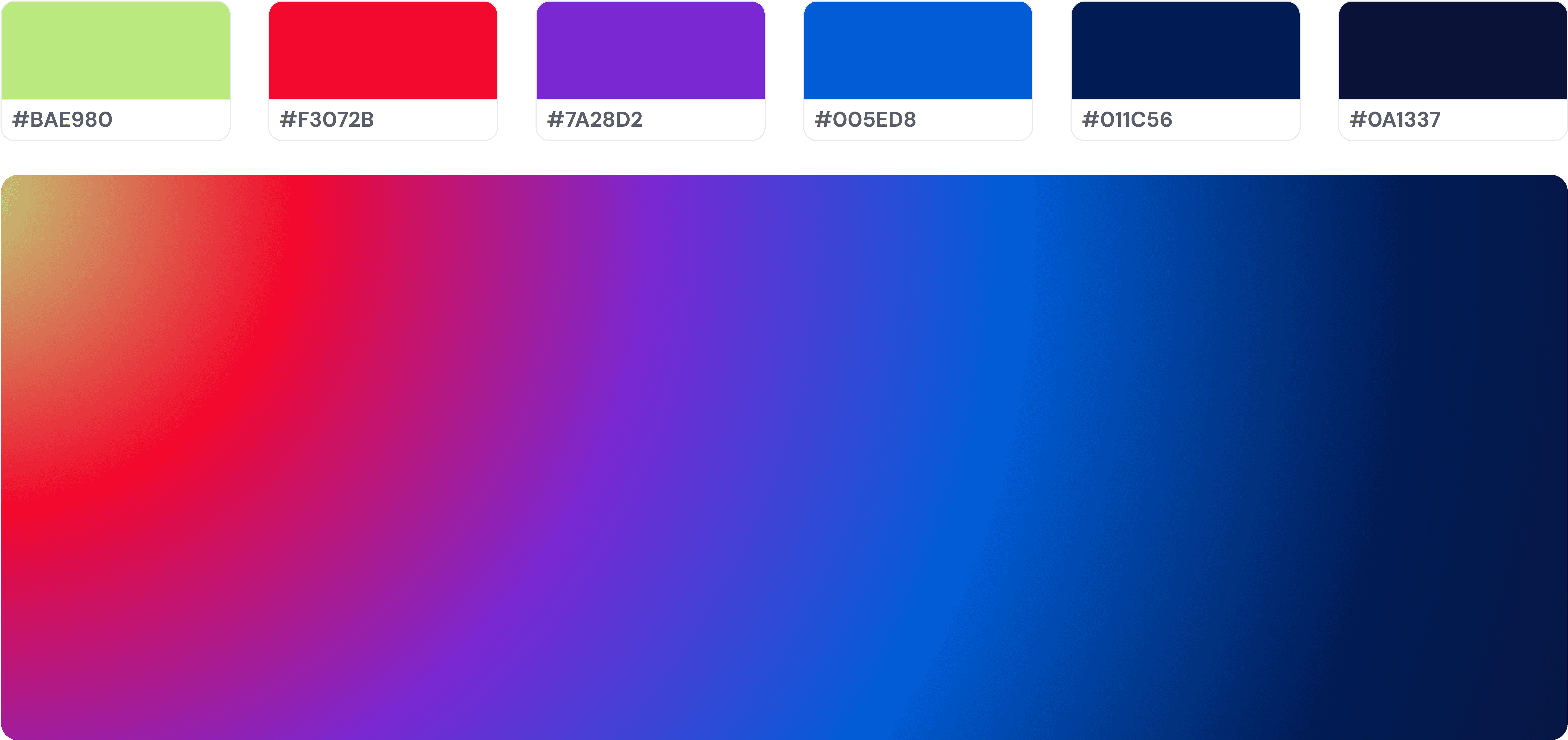
Keywords
The Challenges
Legibility vs. Expression
Maintaining readability while delivering bold, expressive type motion was a key tension throughout the project.Clarity in Abstraction
I had to ensure that even with abstract or experimental visuals, the core message and emotion remained accessible to viewers.Purposeful Motion Design
Every animation decision needed a narrative purpose—avoiding motion that felt purely decorative or unmotivated.Emotional Range Through Type Only
With no characters or scenes to lean on, conveying the novel’s layered emotions using only typography and timing was both challenging and rewarding.